The man in the bathroom outlet store (‘outlet’ as in trading, not plumbing) reminisced about his grandmother using a blue bag to whiten the sheets. He was forthright, practical and, above all, humorous, which was a refreshing change from the serious salespeople we’d met up to that point. “No,” he said, dismissing a vanity top I thought might go. That’s what I needed to hear.
The outlet store gave us an insight into how the basin and vanity top we had selected would wear. Shop-soiled and often seconds, they showed unfortunate marking and we, thinking of me coming in from the garden with grubby hands, changed our minds again.

Here we are, me and my Bathroom Advisor Extraordinaire, back in the main showroom, looking contemplative and serious. We’re matching a ceramic, semi-recessed basin with a hard ‘Carrara (but not really) marble’ surface (shown in the block sample) and the floor tile.
Back to the drawing board. My B.A. (Ext.) suggested a mood board. I patched something together over the week.

My mood got bluer as I obsessively found, selected, then re-selected and moved things about. I researched all manner of toilets, looking for one that had some character and a high pan height. My other sister-in-law advised chrome tap ware, as the gunmetal we’d chosen would probably date. She and my brother endorsed the idea of a high pan height for the toilet. Gradually my mood board took shape.
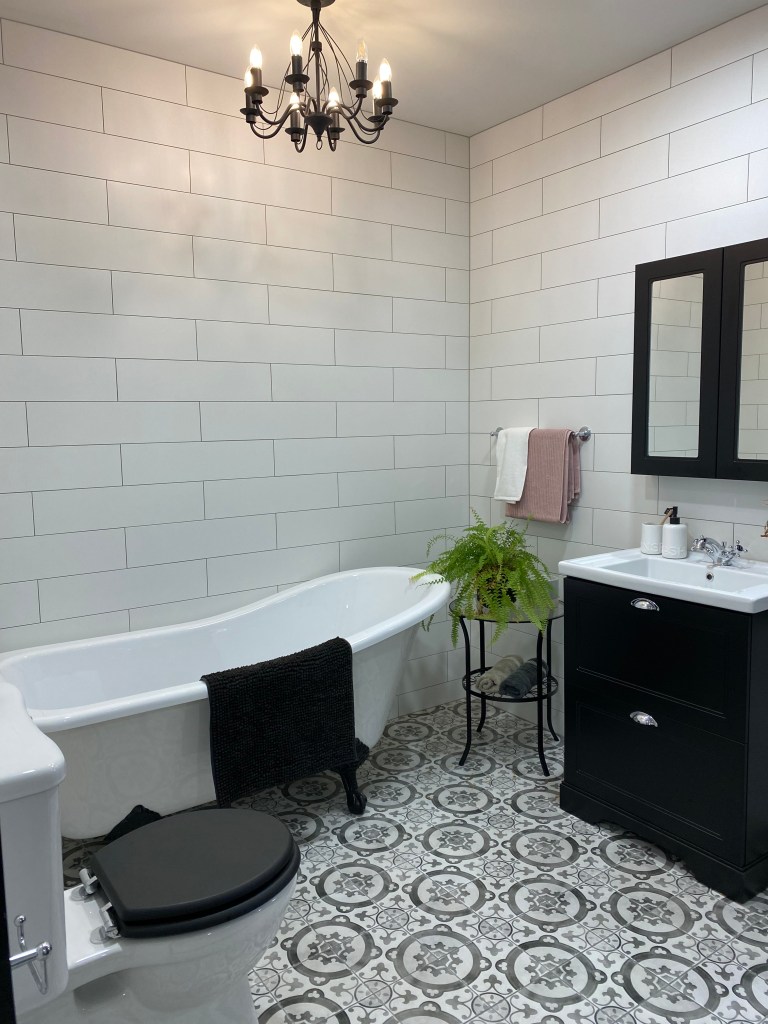
Although still a work in progress, the mood board has helped (as B.A. Ext. knew it would) to visualise the end result and the planning seems pretty much complete. Here’s hoping. Such a fuss about a tiny space! But I was shocked to see what my bathroom looked like back in 1993 before the first renovation (see top left corner of mood board) and I remember how difficult it was to remove all that red paint – and the layers of paint underneath. Now, this new renovation is necessary to address the sinking floor and the impractical shower-over-bath.
Meanwhile, B.A. (Ext.) found a digital programme and made a 3-D model.
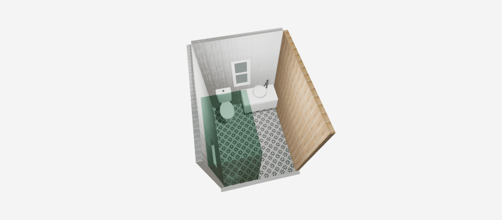
You can move it around (but not on this screenshot) and visualise how it might look, hence the well-deserved new honour: ‘Extraordinaire’. And, hopefully, we’re done with the bathroom blues.