Views from the sea

Rakiura

The artist featured in the exhibition Encountering Aotearoa at the Christchurch Art Gallery Te Puna o Waiwhetū is Cora-Allan Lafaiki-Twiss (Ngāpuhi, Ngāti Tumutumu, Nuie – Liku, Alofi). I am fascinated by her work. She went by boat around Aotearoa to look at the land and sea. In part, this was to see the land as the crew of the Endeavour might have seen it – with Tupaia and his assistant Taiata on board – as they circumnavigated and mapped the land. Cora-Allan asked her pāpā, Kelly Lafaiki (Nuie – Liku, Alofi) to accompany her as assistant on the journey. Videos screen on a wall, documenting the journey and the making of the work.

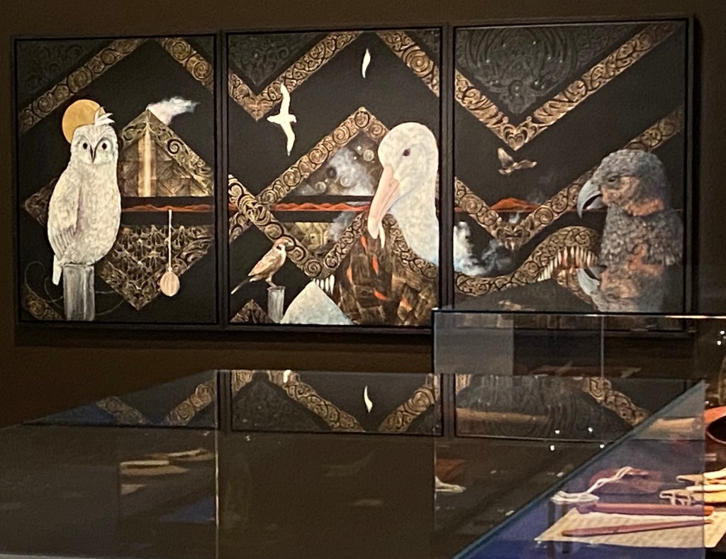
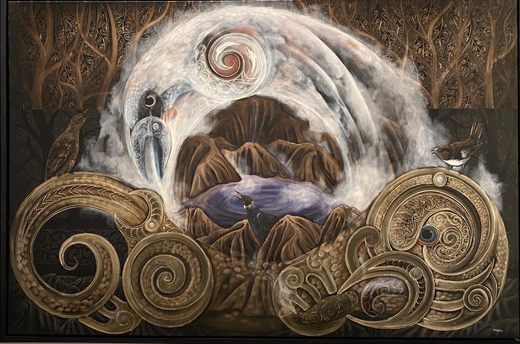
Frames around many of the paintings remind me of boat windows with their rounded edges and toughened glass. The artist uses hiapo, traditional mulberry bark paper often known as tapa cloth. It was soaked in sea water in each place a work was created. I looked at the back of the hanging paintings and could see where the sheets of paper had been joined and I could appreciate its texture and thickness.

Hiapo, mulberry bark paper, is used for the art works

The pigments used are from the whenua (land). So the making of the work is as fascinating as the paintings themselves. In a glass case, are some sketchbooks and a marvellous wooden toolkit which folds out, with a sliding drawer in the base and a leather handle. This would have been ideal when working from a boat.

A panoramic sea view on panels stretches across the gallery space on a wooden frame.

In the entrance to the exhibition, these islands seem to float on the grey/blue background.

Large hanging paintings lead you further in. The details are intricate and significant, with traditional and contemporary elements, and the photos don’t do them justice.

Maunga (mountain), Moana (sea), Whenua (land) and Waka (boat)

I look forward to visiting the exhibition again.

Post Script: I particularly liked the painting Rakiura. Later, I realised I was wearing a Glowing Sky jersey which seemed appropriate being a brand named for Rakiura (Stewart Island) with its views of the southern lights or aurora australis.

Women as creators and artists

Ngaio Marsh Painting by Olivia Spencer Bower

The four session course Women as Creators and Artists at the WEA finished yesterday. I expected an academic approach. The handouts had that, but mostly we had an immersive experience, visiting the Christchurch Art Gallery Te Puna o Waiwhetū across the road and talking about women’s lived experiences.

From Housewives of Art by Sally Swain

The course featured the work of New Zealand women artists over time. We were taken into one of the stores behind the scenes of the Gallery to look at the work of various artists involved in the Canterbury Group. Two curators as well as our tutor contributed knowledge and anecdotes about the artists, how they worked together and influenced each other.

Representations of the Canterbury landscape

The last two sessions featured current artists. These were notable for their ethnic diversity as well as their approaches to their art. Some of these exhibitions were ones I would have passed by as ‘not my thing’ and I realise I’m a ‘grazer’ of art. The course helped me to look again. One installation featured cat’s cradle-inspired structures in luminous, almost neon, string. Subsequently, when sunlight lit up an intricate spider’s web running from my dressing table to a shelf I thought of that installation and marvelled at the spider’s skill. As soon as the sun moved, the web became invisible.

Yesterday, we looked at women’s contemporary art on the ground floor of the gallery, beginning with a large hooked carpet and seat which depict the Canterbury landscape. Spring is heart-break, a line from an Ursula Bethell (1874-1945) poem, was a theme which artists depicted in a variety of media. Often natural materials were used such as driftwood and kelp. I thought of the driftwood structures people have made on the beach and lakeside I visit.

Artist: Heidi Brickell

I thought of Mahuika, keeper of fire, who produces fire from her fingernails in the manipulated photograph below. Here, she seems to be about to light her cigarette. Looking more closely, I observed the mis-match (haha) of images – the stiff curtain against a plush replica couch, on which is superimposed the woman with silvered hair and painted thick eyebrows fashionable with young women now, wearing a clumsily-made formal (bridesmaid’s?) 1980s dress. She has a calculating look on her face, and is she making a rude gesture? Revenge is one of the themes of the series of photos of which this is one. Ancient power defying modern expectations of femininity could be one interpretation.

The Breath of Uru-te-ngangana (atua of light) by Tia Ranginui (1976-)

A series of large paintings showed skewed perspectives, nightmarish characters and odd combinations which “signal a desire to create a new, messier world by turning our current one inside out” according to the accompanying notes. I didn’t know how to express that in my own words!

Artist: Priscilla Rose Howe (1994-)

Our tutor encouraged us to volunteer as gallery guides which involves three months of training. She told us that you learn by teaching (as I know) and reminded me of the heading of our first handout: “Art, Looking at, Seeing, Understanding”. Probably, on my own, I would have passed the Priscilla Rose Howe paintings with a bit of a shudder. Now I feel braver to look, see and try to understand.

Our course finished with these statements, which our immersive experience has shown.

Art is a product of its time and place.

By the inclusion of women, art and society has changed dramatically in the last 100 years.

Art, especially for women, is useful.

Our tutor was Diane Swain

Ngā Hau Ngākau

Waraki (Dawn Chorus)

The images in this exhibition (the title translates as ‘Breath of Mine’) take you from the physical to the spiritual world. The more you look the more you see. The patterning and carving elements remind me of this:

There was once a carver who spent a lifetime with wood, seeking out and exposing the figures that were hidden there.

Patricia Grace. Prologue to Potiki. Penguin Books (NZ) Ltd. (1986)

The exhibition space shadows the shape of a whare whakairo (carved meeting house). It’s about manu (birds) “treasured in Māori mythology as messengers that connect the physical and the spiritual realms” says the introduction, and honours the work of musician Hirini Melbourne whose bird waiata I enjoy. He researched early Māori instruments, which often echoed bird sounds, and revived their use as you can hear in the soundscape accompanying the exhibition.

I particularly like the painting of toroa (albatross) having seen them in flight recently at Taiaroa Head, and also the detail of sea life. If you look closely, you can see nets and boats, so exploitative human interaction is there but, mostly, there’s the power of nature such as water and wind and the special character of each bird and animal. The triptich panels echo the kōwhaiwhai panels used for storytelling and oral history in the whare whakairo.

The exhibition is a travelling one, in Christchurch at the pop up Canterbury Museum space at CoCA until the end of April. The link will take you to better photos than mine. You can also hear the music here.

The paintings are by Robin Slow and the carvings are by Brian Flintoff. The musicians are Bob Bickerton, Ariana Tikau, Holly Tikau-Weir and Solomon Rahui.

A painterly eye

Now that the art galleries are closed, I’m pleased I spent so much time carefully viewing each painting in the Frances Hodgkins European Journeys exhibition on three occasions. By my third visit we knew more about Covid-19 and I was not keen to use the touch panels! There was an elderly couple carefully viewing the paintings. I felt quite sorry for them (even when one of them sneezed copiously); they looked quite frail. It would be a last treat, I expect, as before long over-70s were asked to remain at home.

I took note of who owned the paintings. The Auckland Art Gallery seems to own most of them. Other owners include the Christchurch Art Gallery, Te Papa, the British Council, Dunedin Art Gallery, and some private owners such as the Fletcher Family Trust. I was a little disappointed not to see the painting entitled Loveday and Ann. I looked it up online and found it is currently with the Tate St Ives. This seems fitting, as Frances Hodgkins lived and worked there for some time after she had to return to England from France at the beginning of World War I. The painting is dated 1915 and had two private owners (one of whom inherited it) before being purchased by the Tate London in 1944. It shows two women with a basket of flowers. The different characters of the women are quite striking, not to mention the bright colours.

The striped chair in Loveday and Ann reminds me of Hodgkins’ self-portraits which feature a favourite chair with objects belonging to her arranged haphazardly. I like this way of doing a self-portrait.

After my second viewing of the exhibition, I found the way I looked at things was enhanced. I would be struck by how a scene looked like one of her paintings. Even the pink bathroom cloth hanging over the window catch with pink flowers in the garden beyond reminded me of the rose tones she used in her later work particularly. She had a number of paintings which showed objects in the foreground and views through an open window or door.

The first time I experienced this “painterly eye” effect, was on observing my hens scratching about under the raspberries.

I wasn’t sure, but I thought one of Hodgkins’ paintings featured hens. On my third visit I found it.

This is an early work, painted in 1914; watercolour and charcoal. It is entitled Barn in Picardy. (I’ve also caught the reflection of the exit sign in my photo!) This painting is owned by our art gallery, so I look forward to seeing it more often.

Many of Hodgkins’ paintings respond not just to landscape in the many places she worked, but to events at the time, particularly wartime. In World War I she tended to paint portraits or inside scenes, as she could come under suspicion for painting outside in St Ives, on the Cornwall coast. In World War II more abstract trends in painting seem evident in her work, but rendered in her distinctive style. Her portraits too, could make social comment, such as The Edwardians (1918).

I like this photograph of her, particularly her woollen socks! Worn over thick stockings, I could see, by looking closely at the bigger-than-life photo on the wall at the exit from the exhibition. Yet bare arms. Practical considerations, perhaps when painting. And does her slumped posture indicate how grateful she is to sit after painting for long hours? She was 76 in the year this was taken (1945).

The Press today lists online exhibitions we can visit while the galleries are closed. A nice way to feast on visual experiences and nurture (code cracker word today) the painterly eye.